

Exploring Freelancing
Navigate freelancing as a developer; find clients, manage contracts, ensure timely payment, and learn from experiences!
 Mockup generated by Mockuper
A simple screen onboarding is important for your users to understand what your app is about, and what unique feature values their time. Also, when you release an update or a major feature, you want the user to try it out and introduce them with a splash screen on the first launch.
You may have seen the beautiful “Welcome to Stocks” splash screen to introduce the features of Apple’s Stocks application or “What’s New in Photos” to update the user about the compelling features implemented.
We’re going to create something similar, using reusable views in SwiftUI.
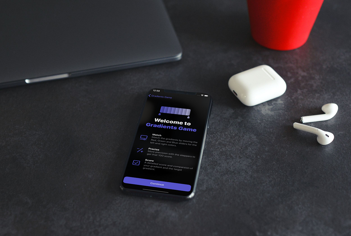
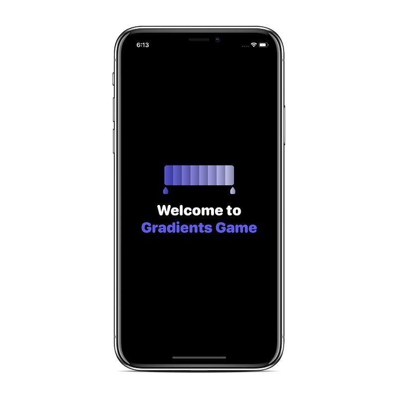
I recently launched my first app, Gradients Game, and implemented a splash screen.
This is how it looks:
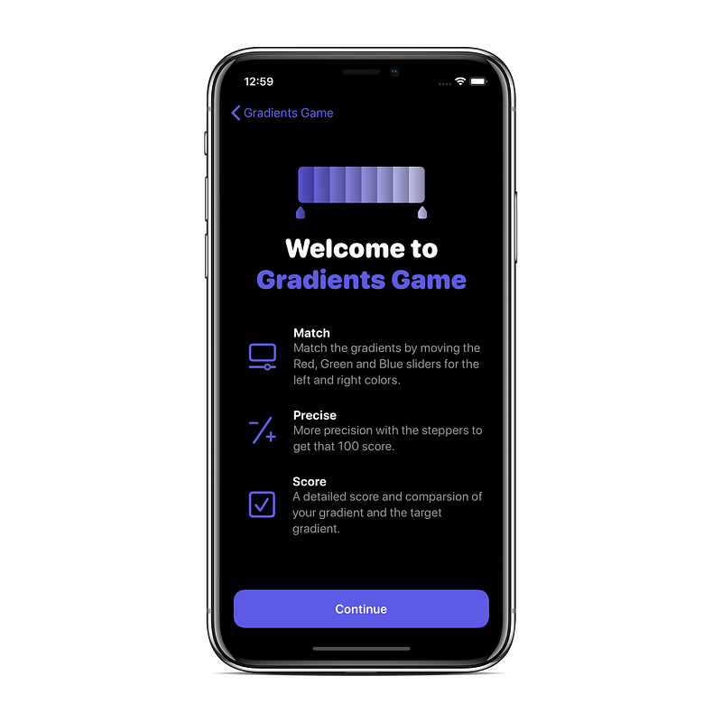
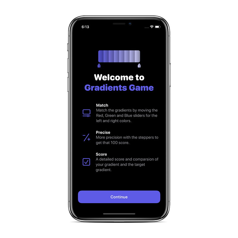
We’ll build an identical screen so you can use it in your own SwiftUI app.
We’ll be breaking down the UI into two parts:
- The image on the top and the welcome title
- The information view
Let’s start with the information detail first, as it’s the best example of using reusable views in our case.
Information View
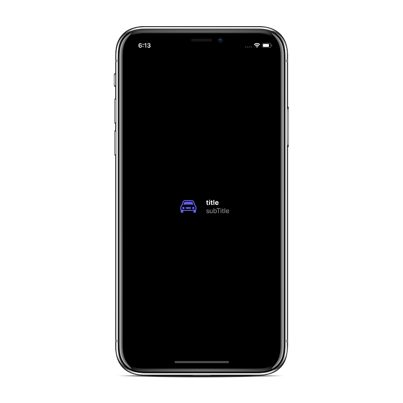
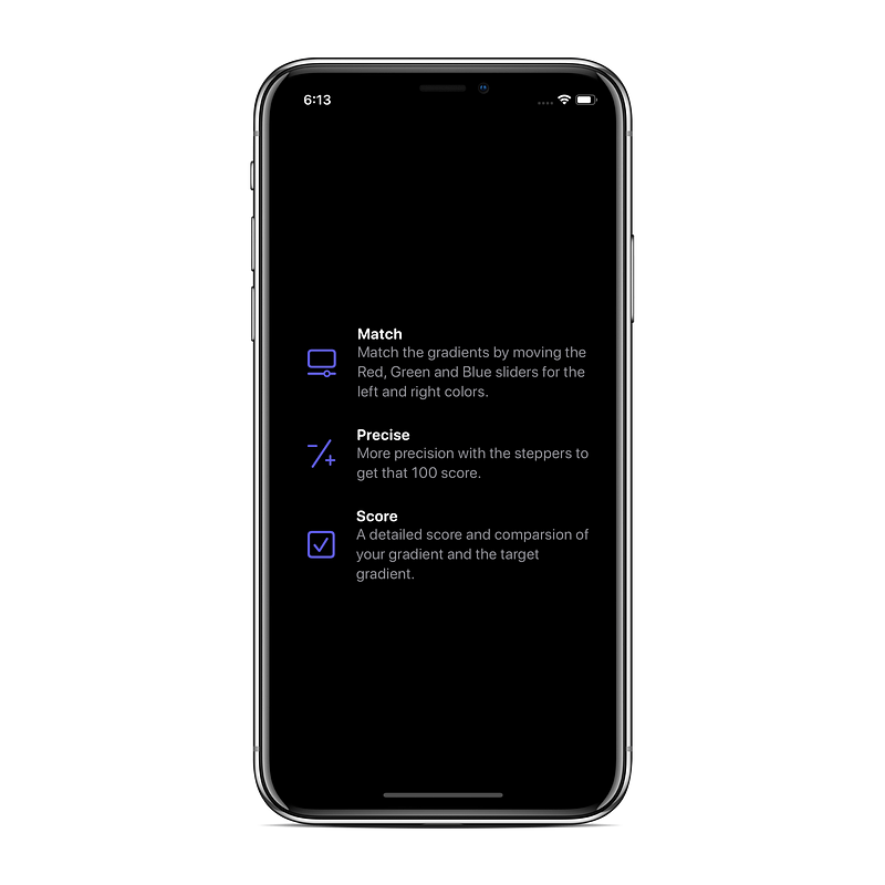
The highlight for a particular feature usually contains a symbol or an image to signify, a precise title, and a subtitle to give slightly more information explaining it.
Create a separate view to show these three components. This way, we’ll be able to reuse the view for any feature we want and supplement it in the future.
For this article, we’ll use SF Symbols, as they are really easy to work with and flexible.
We have the title and the subtitle laid out vertically, so embed it in VStack. Embed the whole row into HStack with the image on the left side.
You can customise this code to your requirements with different color and size combinations.
Here’s how it will look:
Next, we’ll use a container to contain these rows. You should have** **the data as models, but for the sake of simplicity, let’s add it in a view itself.
Title View
The title consists of the logo and the name of your app. Usually, the name is coloured according to the primary colour used throughout the application.
Adding Everything Together
We’re adding a Spacer() in-between so everything fits in perfectly.
The code for the custom modifiers used:
Conclusion
You can add animations to make it even more interactive.
I’ll add another article on that soon, as there are a few bugs in iOS 13.2 making it difficult to work with animations in SwiftUI.
Exploring Freelancing
Navigate freelancing as a developer; find clients, manage contracts, ensure timely payment, and learn from experiences!